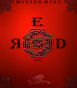
 For the product design project I decided to go with a product that I am quite familiar with making and enjoy. Album covers have intrigued me ever since I began making music for their marketing power and all out coolness. First I look for a background usually a plain color but always one with good center lighting and a texture. Next I find a interesting graphic for the center of the piece which the focus will be set on. After adding effects such as bevel, outline, shadow, gradient, etc. ; I add the words I want to be on the cover and change the effects individually. Lastly I find all the extra graphics that really bring the piece together and WALLAH! A MASTERPIECE!!! I think the most successful thing about the design is the overall continuity of color and style within the piece. The only thing I would change about my product is the font of RED, however, since this piece was made on the school computer there is not much I can do about that. I had a lot of fun with this project and can't wait for the next! 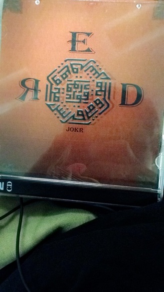
0 Comments
Leave a Reply. |
Archives
December 2016
Categories |
 RSS Feed
