|
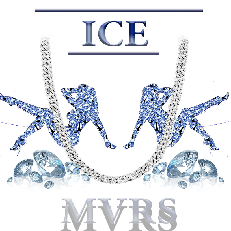
The most difficult part of the 3D process for me was the initial shaping of the object. Even basic base shapes are hard to make even and ready for 3D conversion. I really like the colors and design I made for the piece however. I made the inside black with a J on it and red borders. I began with a diamond shape which I thought would make for a good iconic key chain. Next I added the borders and added bevel and outlining. Next converting the file to a 3D .STL file and uploaded it into Tinkercad. My inspiration was Scooby Doos collar I wanted my own with different colors that had a J. 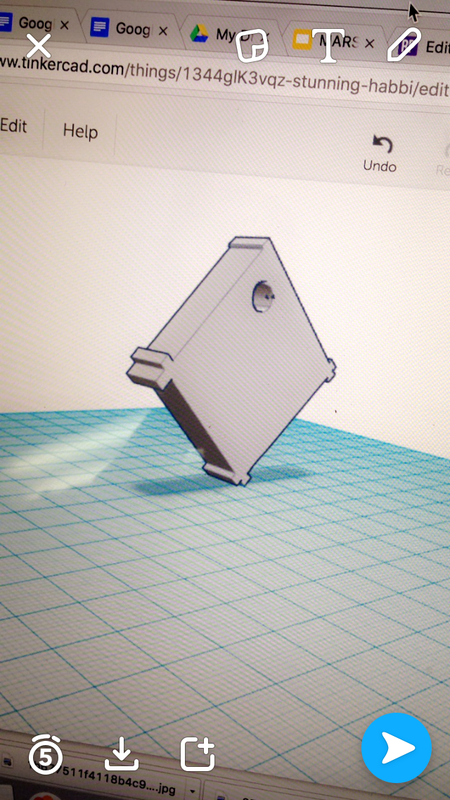
0 Comments
 For this vector drawing I traced over a low opacity layer of Mario's head. I really like how clean the drawing come out however I wish I knew how to color better and shade. I tried using gradients but it came out weird every attempt. In the future I hope to be able to make a more visually colorful piece of art.
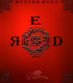 For the product design project I decided to go with a product that I am quite familiar with making and enjoy. Album covers have intrigued me ever since I began making music for their marketing power and all out coolness. First I look for a background usually a plain color but always one with good center lighting and a texture. Next I find a interesting graphic for the center of the piece which the focus will be set on. After adding effects such as bevel, outline, shadow, gradient, etc. ; I add the words I want to be on the cover and change the effects individually. Lastly I find all the extra graphics that really bring the piece together and WALLAH! A MASTERPIECE!!! I think the most successful thing about the design is the overall continuity of color and style within the piece. The only thing I would change about my product is the font of RED, however, since this piece was made on the school computer there is not much I can do about that. I had a lot of fun with this project and can't wait for the next!  ..The movie Coraline presented by Focus in association with Pandemonium is a visual masterpiece that keeps you on the edge of your seat till the end. Coraline was a huge task for the animators which worked over 28 at a time 24/7. The amount of detail and precision needed to complete this task was tremendous. Only 90-100 seconds of the film were shot each week and the movie is a 100 minutes total. Lead designers Deborah Cook and Georgina Hayns, were sure in over their heads with this one. Coraline is made with a mix of wire and clay puppets as well as some other mixed media and animation. This movie is special to me because as a child it was the only animated movie that really could scare me. The images and scenes are scary however very indulging...
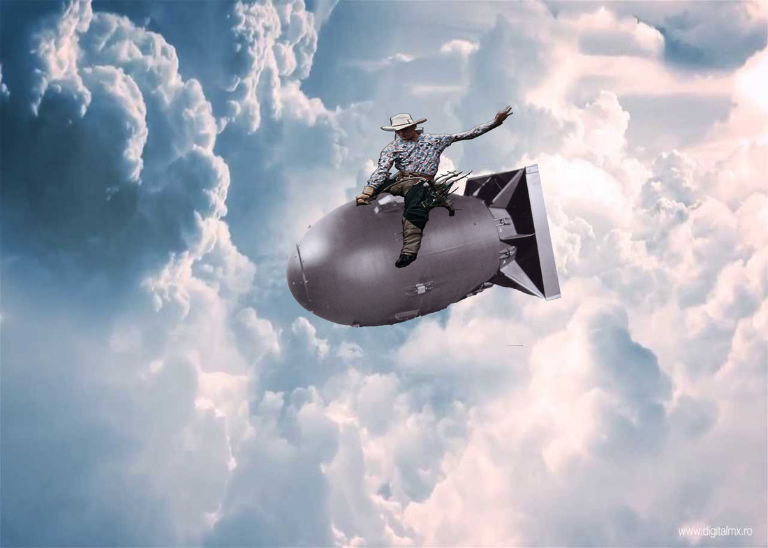
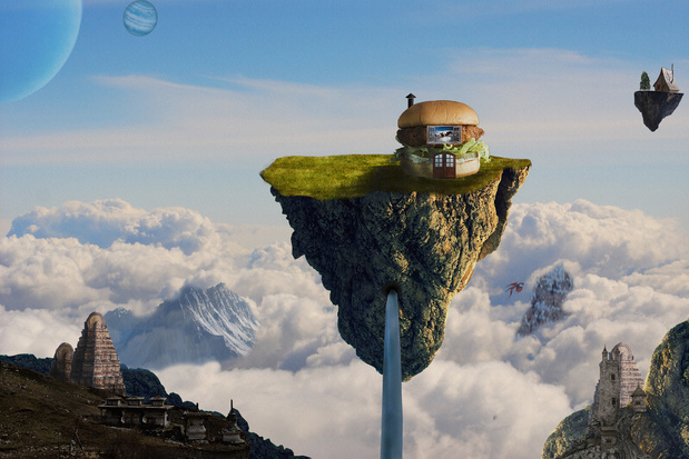 This magical cliff top oasis is the happy residence of Mr. Cow, who spends his time in the clouds in his humble abode. He is surrounded by a beautiful landscapes, magnificent waterfalls and mysterious temples a perfect place to spend the rest of eternity. As you may have guessed Mr. Cow is now in someone's lower intestine, but his soul if free to wander this paradise.
My original idea had no vision for Mr. Cow and his house. I simply wanted to create fantasy piece that incorporated many different elements. I wanted a heaven like feel so I chose a view of clouds from over head. Then I searched google and found mountains that would fit perfectly into the clouds and create a greater than earth feel. The most tedious part was finding the temples though. I had to scavenge and find ones that blended well, were easy to mask and all had the same general themes. I really liked the tibetan temples because they gave a fantasy feel. For the floating islands, I simply masked out cliffs, flipped them upside down, added grass tops, and then finally shaded the sides to create realistic lighting. If I could make any changes to the piece it would be the blending of elements. The mountains in the clouds look spectacular however the lighting is off on the ones in the foreground. |
Archives
December 2016
Categories |
 RSS Feed
